n what way does your media product use, develop or challenge forms and conventions of real media products?
In the preparation of my media product - which was to create a music magazine front cover, contents page and an article, all based on the Indie music genre, I had to guarantee my final product realistic so it would be able to sit on the shelves alongside other major monthly magazines. Consequently I carried out some research of other products and into my potential target audience, 15-25 year olds. My main target audience is female, but I would like to appeal to males too.
My product consists of six pages: a front cover; contents and a four page spread. I worked solo on this project, doing the research, editing, the Photoshop work and the designs solely by myself. I researched magazines of today to gain the knowledge of the typical ideology, connotations and conventions of a magazine aimed at fifteen to twenty-five year olds out in the shops today. This helped me produce a magazine of the same standard, inspired by the indie music genre.
 I aimed the cover at both sexes. I did this by having a conventionally ‘sexy’ posed female model as the cover girl, yet I kept the colour scheme to cool blue tones, which are stereotypically masculine - the colour scheme was retained throughout the magazine which gives the unique magazine its own house style, just like ‘Blender’ (2008) often keeps its layouts practically the same, with a very large image of the model in the centre of the page and little hooks around it. Having the same colour scheme throughout the magazine gives it its own house style
  and makes it more recognisable, so that when the reader goes to buy a magazine, they just need to look for the blue colour scheme of the magazine I’ve produced and their brain automatically tells them it’s the norm.
Furthermore, having all the text justified and in a specific layout helps the audience just look at exact areas on the page, such as ‘big quotes’, bold writing, the font type, the font size and the story hooks used, often used in ‘Q’ magazines. I broke this convention by placing them all down the left hand side of the cover. I used an asymmetrical cover layout. These all help the naked eye focus on that area where the magazine has emphasised to draw in attention. On the cover the story hooks aren’t straight, but are justified to the left hand side of the cover. Using bold writing for the story hooks emphasises them so that the reader spots the catchy hooks without delay. I justified the layout of the cover so that the image of the model was in front of the title. I did this because people are meant to know the name of the magazine whether or not it is partially covered or not. Magazines such as Blender (2007), NME (2009) and Vibe (2007) use this convention.
The barcode, the price and the date of the issue are all based on front cover conventions too. Using a ‘regular’ price of £1.95 was chosen by the niche market audience. They chose this cost through the questionnaire I handed out, and they thought that £1.95 was the perfect, yet, regular price to pay for a magazine of this type.
I kept to the colour scheme and typical conventions of a magazine’s contents page, yet made it my own. I did this was by using a layout that was simple yet unique; I also used new images of Josie (the cover girl model) in the same clothes, just so she wasn’t in the same pose on the contents too. I used columns on the contents which almost every magazine uses, whether it is one, two or three. I have the magazine website on the contents page too, which is common in the age of web 2.0 for magazines to have a website so readers can interact with the publication, which gives the magazines more reputation, if people ever wanted to go on the website. I added an editor’s message to the contents page, to let the reader know a little more about the magazine – this is something I’ve seen in other magazines like ‘Uncut’.
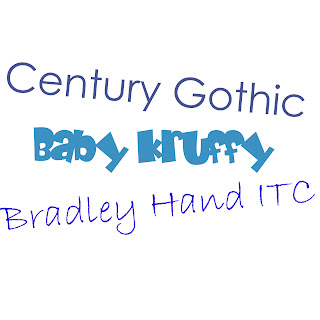 The justification of the text is aligned to the right hand side. In the main article section of the contents page, a funkier writing font is used - ‘Baby Kruffy’ - this is to grab the readers attention as it is cooler than the normal ‘Century Gothic’ used on the left hand side of the page, which is used to list the smaller stories inside the magazine.
I also found in magazines such as Blender (Aug 2007) the cover girl featured in the main article of the magazine., so, I used my cover girl as the main feature article too, to stick with the common convention in a magazine. The article I created could be seen as quite inspirational as it is based on an up and coming celebrity who has had to chose her security and her welfare over her new found career as a lead singer in a newly famous indie band, which is becoming the new genre in the charts today. This acknowledges a heroine-like character and shows ‘Jane Lynxx’ in a positive light. Although my article is sympathetic and world encourage my readers to aspire to be like her, it shows some of the pitfalls of fame.
Normally, articles tend to give off vibes to the reader, such as, ‘I could do that, ‘I want to be like her’ or ‘that would help me’, but this sort of emotion doesn’t occur in my main feature article. The vibes given off in this article are more of a pity or self belief feeling, rather than ‘I want to be like her’. The article, I would say, is more for the females which would read the magazine, yet I did try and make it appeal to both sexes.
The layout of the article is that the text is set out into columns which are a convention typical in the majority of magazines. I used a tease at the beginning of the article, which gives an insight into the juicy bits, without giving the story away. I also used quotes from the story and highlighted them. I did this because the most interesting quotes would attract the reader and make them read the full article rather than just glancing at it.
The images used on the article pages were those from the same shoot of the cover. I did this to connect both the cover, contents and article together, seen in Vibe and NME.
I created a negative photo strip to link in with the story. It links in with the story because the name of the band is ‘The Photographers’ so I thought photos compliment the story effectively.
How does your media product represent particular social groups?
My product represents white female upper working class / teenagers in a positive light, showing how they can achieve success today, whether it turn out good or bad to start off with. I did this by giving an aspirational model for my target audience to seek to be. The main celebrity/main character on the cover also appeals to my niche market; indie, as she originally was in an indie band, and dresses with the genre’s typical dress sense which represents and relates to my particular social group. In turn I also present the indie-loving sub-culture in a positive light.
What institution might distribute your media product, and why?

Bauer media publishes worldwide, with an approximate empire 282 magazines in about 15 countries. They work closely with their customers to develop new solutions which make a difference within their business, just like I have by using a questionnaire to find out the customers needs and then acted upon it. (http://www.bauer.co.uk/aboutbauer) I would be widening the market for them, which will offer them an opportunity to expand their audience into a new market of 15 – 25 year olds. With Bauer I would be widening their portfolio. Also publishers from other retail magazines such as Blender’s:
Dennis Publishing (http://www.dennis.co.uk/dennis_site/about/dennisgroup.php) I’m sure would publish my magazine. As I am sure my media product would get far in the current market if it was published by one of these famous publishers, I know this because ‘Q’ and ‘Blender’ are very popular magazines now and feature their own style and ideology. However, I know my magazine is different and unique which would open up a different type of market bringing originality and interest in which my income could come from being a unique type of magazine; where hopefully a lot of the public would purchase it rather than other top magazines on the shelves in the shops now. This is because it features the stories that real media products have such as events that are happening at the moment, exclusive interviews, chart lists, articles and other extras in the magazine. But the income would come from the unique images and style on the cover, which would draw in the audience population and gain a good reputation for the magazine, which would then give a better status for the publisher as I have widened the niche market and would have created another unique magazine to add to their empire. Seeing as my magazine is aimed largely at females, I claim that I would be opening a new niche market because most music magazines today, for this age-group are aimed at men. The fact that I have produced a magazine suitable for a nationwide niche audience who like indie music, as opposed to a magazine with a very specific localised audience would help widen Bauers audience. http://www.bauermedia.co.uk/Press-Office/Magazine-Covers/ in this link are some of the magazine covers they’ve published.
What would be the audience for your media product?
Name: Sophie Handy
Age: 17
Occupation: Full-time student.
Why would she read this product: I sense my music magazine would hit an audience of the upper teenage working class population, interested in the latest music. I am aiming largely at a female target audience – but I hope by my colour scheme and the fact that the males are more likely to be interested in this sort of music and backgrounds – that it will appeal to males too. Someone with an office job would buy this magazine against others on the shelves, maybe with an interest in chart music and attends the latest gigs around the country. Someone with a peaceful night time, time to chill or relax and read a magazine – like the one I have produced, and a lot of spare time on his hands, other than the time spent at the latest music band gigs and at his job. Maybe even a fit and active man, around the age of 20-25.
However, the overall age group I have aimed at is 15-25 year olds with a female main gender. Upper class working class readers with enough disposable income to buy downloads, CD’s, go to gigs, and buy this magazine every month is the ideal niche market. I created this reader profile from my research on information of the people who actually tend to buy magazines.
How did you address/attract your target audience?
When planning how to create a typical, modern music magazine, I had to find out what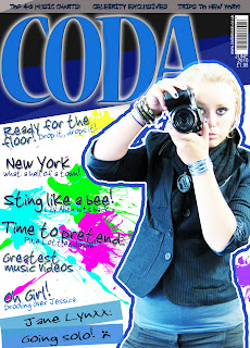 the target audience wanted.
 To begin with I created a questionnaire, of which I received my audience’s opinions on what they would like to see and expect in a music magazine today. I asked questions such as: ‘What would you expect typically in a modern day music magazine?’, ‘’What do you look for in a magazine?’ and ‘What type of music do you like most?’. Initially, these questions benefited me and the audience I’m trying to satisfy. The rest of the questionnaire can be found on:
By doing the questionnaire, gave me an overall view on the type of magazine the audience expected, which put me ahead of other magazines as I actually asked the target audience what they would like, and then the results they gave me went straight into my real media product. I have based my hooks on ideas from research and my audience survey.
I have also carefully analysed existing products so I could apply their conventions to my real media product.
Having an interesting article and appealing hooks on the cover of the magazine – like I do – has given the magazine a better attraction and does appeal to my target audience. I know this because Sophie Little, took a look at my product and ‘really liked it’ when I told people to take a look at it (in the age range of 15-25 year olds) their results were poisitve. For example: ‘I like how your expanding the population of Indie music’, ‘great layouts’, ‘good poses and images’, ‘modern and up to date/in with the latest fashion/styles’, and ‘nice colours’.

>
I’m exploiting the notion put forward in Naomi Wolf’s ‘The Beauty Myth’ (1991). She suggests pictures of attractive women are used to sell products to women because they’ve been conditioned by the patriarchal society to want to be like the models on the covers, so they buy the product. I found that this was a typical convention of all the magazines I looked at on the shelves in nowadays such as; ‘Blender’ (Nov 2007) and ‘Vibe’ (Dec 2007). They do this by having almost nude, sexy-looking posed, gorgeous, slim and airbrushed models are being posed on the front of magazines as a source of grabbing attention. http://naomiwolf.org/
Another theory I exploit is Uses and Gratifications. This suggests that the audiences actively use media products and magazines to meet some of the needs identified. Magazines may be used by the audience to compensate for the lack of self-esteem or social success, as an example of the girls’ teenage lifestyle magazines, which address the audience as a ‘best friend’ rather than an authority figure.
Magazines always exploit the theory of uses and gratifications because the target audiences they’re aiming to gain, will identify (though most of the time its wishful thinking) with the lifestyle it promotes. Marjorie Fergusons theory (1980) identified four types of facial expression in the covers of magazines found on the shops shelves today. I think his theorem best covers my magazines stylistic features due to the fact my model isn’t sexually posed, but looks quite invitational. http://lauraarobinsonn.blogspot.com/2009/11/majorie-fergusons-theory.html.jpg)
McQuail, Blumler and Brown (1972) defined four major areas of need which the media in general seek to gratify, including:
- Personal Identity – people can relate to my cover story, and will buy it because they feel some sense of belonging because the magazine involves them by featuring a genre of music they feel important to them.
- Surveillance – people can use my magazine to retrieve information about topics they’re interested in. Like from a contents page.
Also Davis et al. and Julianne Dickey convey how they take the traditional stance that images of women are dominated by the male gaze – the masculine view of female beauty – and the female form is objectified for the male pleasure, giving a very narrow definition of femininity. Such theorists are also critical of the media industry being run by the masculine view. For example: most photographers are male – and I went along with this convention of using an attractive model, but tried to empower her by posing her photographing those ‘gazing’ at her.
However, all of these theorists lead to conventions in the magazines today, which sell them. I used a model of the same age range as myself and the age of the audience which adds to the appeal. As the audience will look at the magazine for a sense of personal identity and often possibly aspire to be like that model, although theorists state different or state the negatives.
I tried to appeal to a male audience too by using blue colours within my work to attract a male audience. I also used articles based on the male population to attract them to reading the magazine too. Pages on the contents page such as ‘Calvin De-Klein’, ‘Blind’, ‘Ilivex’ and ‘Blink 182 shoutouts’ are all based at a male audience. I could have also chosen a male band to be featured on the contents page at the bottom instead of the three girls, to make it appeal to the males a little bit more.
My analysis of existing products and research into my potential audience allowed me to target my production accurately – basing ideas for stories, features, hooks, etc on what my audience want.
What have you learnt about the new technologies from the process of creating this product?
I enjoyed using the digital camera and the tripod as I experimented with diverse camera shots, such as – medium shot, medium close up, and long shot – and angles, such as low angle and high angle, to show social class and superiority.
I constructed my products on Adobe Photoshop, which I did struggle with at times, but I gradually became more confident and found out different techniques and processes that helped me, such as: making new layers and putting things on top of each other was fairly easy and it looked very effective; cutting out the photograph from the background it was on, using the lasso tools and magic wand, then using the blur tool to blur the edge of the image so it didn’t look too sharp; I also used the hue/saturation/brightness/contrast edits on the image to change the models skin appearance or to change the image to black and white.
To cut out the image of the model on my front cover from the background she was on, I 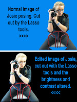 used the normal lasso tool which helps by clicking specific points around an image. Photoshop will draw straight lines from point to point as you continue to click on the canvas. I then used ‘Delete’ to undo a point and try again. This tool is not ideal for cutting out really difficult images, but is good for accuracy as you click where you want cut out.
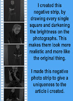 I made a negative strip from scratch. I drew out every single square around the edge of the negative strip by using the square shape tool. I then drew the background as a bigger box than the images then placed all the little white squares around the edge, to make it look like a negative strip from a photo shoot. Furthermore, I added in the images and made them all the same size so it didn't look odd. However, I changed the brightness of the photographs and the saturation so the images where dark and black and white. I did this to make it look like they were negatives from a camera. Then, I fixed all the layers together so the piece was a whole, and then could move everything around as one layer, rather than 70 little ones.
On the cover, I used a splatter brush to create the ‘ink print’ marks on the background, I downloaded this brush off of the internet; I used the technique/process of whitening the hair of the model and her skin by using the dodge tool.
The blog I created allowed me to take advantage of web 2.0 to become a producer of a media artefact with an internet audience of millions who can comment and post about my work. I combined text and images to explain the ideas and processes behind my magazine which can be found on my blog. Using the blog meant that I can layout our plans and show my annotations and it can be viewed by the public, who can provide feedback.
Looking back on your preliminary project, what do you feel you have learnt in the progression from it to your full media product?
Looking back at my amateur preliminary task I feel that I’ve progressed a lot. My imagination, publishing and photography skills have improved and I have a much deeper 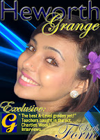 understanding of how to produce a professional product on Adobe Photoshop for a selected genre, age range and target audience. I also feel confident in representing my views about design. I also can see the difference in professionalism between the two products and I can now see how I could have made the preliminary product better by gaining some more knowledge or practise on Photoshop. My research skills have advanced, as I analysed magazines and understood the conventions they used to attract their target audience, like specific colours, fonts and models to communicate a particular message to them. I have understood the importance of audience research by creating a questionnaire and this helped me find their needs, so, I could accurately target my magazine to meet the audience’s needs and produce one that could compete on the shelves ‘NME’. From my study of other music magazines and their conventions, I learned that a magazine should not be too busy, as when there is too much to look at it takes the attention away from the main purpose of the magazine, which is for a reader to actually look inside, yet it should be attractive and eye-catching enough to stand out from the crowd of the mass of other music magazines that are on the shelves today.
 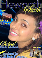 Furthermore, my knowledge of writing in a journalistic style has improved and I’ve very much enjoyed the challenge of completing my production of a ‘real media artefact’ for a deadline. I’ve moved on from producing pages for a magazine with an extremely localised niche audience to planning, researching and producing a magazine aimed at a wider – national – niche audience that can compete in the market with existing products such as ‘NME’, ‘Blender’ and ‘Vibe’.


.jpg)


.jpg)


