Laura Robinson
Tuesday, 10 May 2011
Saturday, 30 April 2011
HOW DID YOU USE MEDIA TECHNOLOGIES N THE CONSTRUCTION, RESEARCH, PLANNING AND EVALUATING STAGES?
So, to answer 'In what ways does your media product use, develop or challenge forms and conventions of real media products?', we decided to film a group discussion and also included individual piece to cameras, to discuss our own roles within creating our horror trailer.
Wednesday, 27 April 2011
WHAT HAVE YOU LEARNT FROM YOUR AUDIENCE FEEDBACK?
In our early stages of research we found that the most popular age group to base our horror trailer at was 15 – 25 year olds, and therefore decided that this would be our target audience. In addition, we produced a questionnaire before starting our project in order to appeal to our audience, as we could have things that they wanted to see.
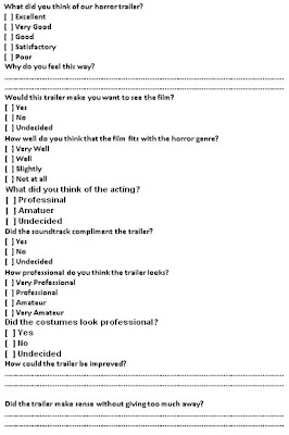 On the completion of out horror trailer we created a hybrid questionnaire and distributed it to a large group of our model, target audience during the viewing of our trailer. We did this as we felt it would work to our advantage as it would gather essential feedback from our target audience.
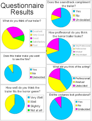
What did you think of our horror trailer / Why do you feel this way?
>'Very Good; I think the shot where the legs are hanging is really dramatic and the range of shots fit the genre.'
>'Good; It looks like a real horror trailer.'
Did the trailer make sense without giving too much away?
>'Sometimes it got a bit confusing but i think that is because it didn't give too much away.
>'It didn't give too much away because you didn't really see the killer.'
I think that the audience screening worked well as it helped us understand the good things and the limitations of the horror trailer we made. It also gave us an insight into what our audience actually thought about the horror trailer as a finished product.
Friday, 22 April 2011
Wednesday, 20 April 2011
Friday, 15 April 2011
EVALUATION:
- In what ways does your media product use, develop or challenge forms and conventions of real media products?
- How effective is the combination of your main product and ancillary tasks?
- What have you learnt from your audience feedback?
- How did you use media technologies in the construction and research, planning and evaluating stages?
Monday, 4 April 2011
AUDIENCE FEEDBACK:
Sunday, 3 April 2011
Friday, 1 April 2011
Wednesday, 30 March 2011
Saturday, 12 March 2011
Wednesday, 9 March 2011
ANCILARY TASKS:
Sunday, 20 February 2011
CHANGE OF PLAN!
Wednesday, 2 February 2011
FILMING SO FAR:
Monday, 24 January 2011
HORROR FILM POSTERS:
Features are normally:
red writing.
wierd fonts.
creepy/eye-catching title.
eerie image.
image of monster/person.
age restriction sign
directors name on case
cast names.
tag line.
Wednesday, 12 January 2011
AUDIENCE AGE:
Saturday, 8 January 2011
COSTUMES:
Wednesday, 5 January 2011
Wednesday, 29 December 2010
MUSIC FOR THE EQUILIBRIUM:
As a group we decided we needed some sort of music which was a little bit more softer and subtler for the equilibrium part of the trailer, rather than the harsh, heavy and bass music of the same track, which we are using for the disequilibrium part.
We thought that using Muse as an acoustic would be better than trying to link in a softer piece of music, which we would then have to decided on. But with Muse as an acoustic we know it works good with the disequilibrium and it will be easier to fit together on the soundtrack.
Tuesday, 21 December 2010
Monday, 6 December 2010
Saturday, 4 December 2010
TYPICAL CONVENTIONS OF A TRAILER:

The film trailers which I have analysed and looked at on Youtube all pursue the same purpose, consuming similar conventions in order to portray the horror genre, of which they all embrace. Some of the common conventions which I accredited were:
Inclusion of film institution logos, most likely one or two companies.Fast pace editing towards the end of the sequence, using specifically straight cuts, to create tension and suspense.Representation of victims portrayed within the narrative stage known as ‘struggle’ suggested by theorist Vladimir Propp.
It is essential for the narrative stages known as ‘Return and Recognition’ also suggested by Propp, to not be included within the trailer as the storyline will be given away. The use of this create enigma and adds tension, supporting the horror genre.
The inclusion of credits such as tag lines, endorsements and the use of famous/successful actors/actresses or directors/producers involved with the film, used to create hype for the current film and heighten expectations, as well as used to persuade the target audience.
Friday, 3 December 2010
Tuesday, 30 November 2010
ANALYSIS OF HORROR TRAILERS:
Equilibrium. (Todorov)
Establishing shots.
Range of angles.
fast paced in areas.
woman voice over.
Crescendos in music to change atmosphere.
catchy storyline.
silence to encourage eerieness.
screams - frightening
Dark mise-en-scene to suggest something bad is going to happen.
Driving rock score kicks in when the pace becomes faster - creates excitement.
'missing' people - good storyline.
heartbeat.
diegetic & non-diegetic sound.
Police - authority.
vulnerabilty.
AS A GROUP WE ANALYSE AROUND 20 HORROR TRAILERS. HERE IS A SAMPLE OF SOME BRIEF ANALYSIS WE DID.


Monday, 22 November 2010
FOR A PERFECT SHOT:
The subject of the film: Always consider the purpose of a shot before you start to set it up. Have you found your subject? What do you want to show about it/them? Is your subject human? - are they wearing the right clothes? Are they in the right mood? Are they doing the right thing in the right place? These are the things you have to think of.
What are the backgrounds/locations:Always consider the background and location in your frames. Does it match your subject? - think colours and textures? Does your subject show up against the background? Does the location give additional information to the audience about the subject? What mise-en-scène will be included in your image?
Composition: Composition is the arrangement within the picture. This is how the audience interacts, as the composition often shows meaning through objects' relationships with each other.
Images are usually composed around the 'rule of thirds'. The rule of thirds is a basic principle where if you imagine breaking an image down into thirds (both horizontally and vertically) so that you have 9 parts. The 9 sections help determine if the composition is good, unique, awkward, centered, left, etc.
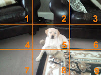 Apart from arranging objects within the picture, another decision that is made in composition is focus, or depth of field. This dictates the depth into the picture in which objects are in clear focus. You may becide to blur out the background, in order to place more emphasis on central or foreground objects. or you may decide to have everything in your picture in equal focus, for instance in a landscape shot, or a group photo.
Framing: deciding where an image begins and ends - is as vital to the meaning of an image as composition. There are a whole variety of camera angles which can be selected to frame a shot and often what is left out is as important as what is included.
By framing two objects together in th e same image, we imply
  a connection between them, especially if there is a physical link. By isolating an object within the frame - for instance showing a swimmer against an expanse of nothing but sea - we can make it seem insignificant and lonely.
Sunday, 14 November 2010
FILMING SO FAR:
- So, so far we've managed to film a lot of scenes and put together 45 seconds of final film. This part of the filming is the equilibrium - the 'happy' bit. Starting the editing wasn't that bad as we all worked as a group and made decisions together.
We've had a problem with the weather lately, due to the heavy snow that has been falling. So we had to put off filming for about 2 weeks, which wasn't so good!
But we managed to film quite a rangle of angles, and shot didtances for our trailer. Although a lot of them won't be used or are too amateur, it's better to have more than not enough.
We've used quite a few locations so far in our filming: Jen's house, Heworth grange School, Leam park, and Heworth Grange CLC.
We're all happy so far with the outcome, and there are some hilairious outtakes i need to put up... I'll keep you posted!
Monday, 8 November 2010
Wednesday, 3 November 2010
COSTUME IDEAS:
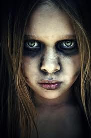
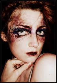
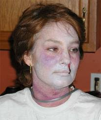
Heavy looking eyes - black and reddy colour eyeshadows, eyeliner, smutty marks on the face and darkened lips. I think the right hand image is perfect looking for a 'zombie' girl who hung herself. I'd just need to add rope marks around the neck, which would look like this...
Thursday, 28 October 2010
FILMING TECHNIQUES:
Cinematic Techniques:
In filming the use of various shot sizes can affect the meaning of what the audience think the shot means.
Common shot sizes:
-gives the audience a sense of location.
-generally used as a scene-setting.
- it normally shows an exterior, eg a building, or a landscape.
-there will be very little detail in the shot, it's meant to give a general impression.
-isolation, vulnerability and space.
-often cities, countryside or scenic views.

Long shot:
- all or nearly all of the standing person fits into the camera frame.
- shows the audience a large scale action.
- gives the audience the full view of a person for understanding.
-plenty of background detail still emerges.
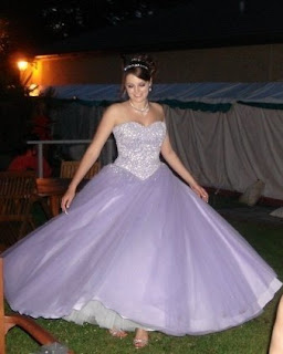
Medium shot:
- character shown from waist up on the camera.
-normally used for dialogue scenes.
-any more than three figures and the shot tends to become a long shot.
-background detail is minimal.
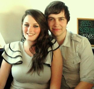
Close-up shot:
- shows the head and neck of a character.
- facial expressions are very important close-up shots for reactions.
- this shows very little background, and concentrates on an object.
- the close-up takes us into the mind of a character.

Extreme close-up shot:
-Very small objects or facial features are in the camera frame.
-Good for tension.
-Shows the audience a specific image.
-Generally magnifying beyond what the human eye would experience in reality.
-The tight focus required on the camera, to let the audience see detail.

I already know a range of camera shots due to AS level media studies, when i used a camera to produce my front image for the magazine.
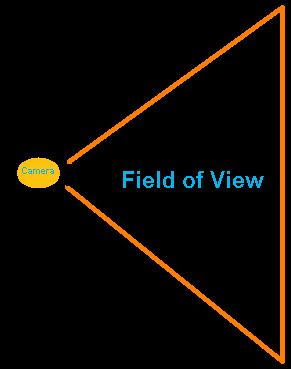
The Field of View (FOV) is the angle described by a cone with the vertex at the camera's position. It is determined by the camera's focal length, with the shorter the focal length the wider the FOV. For example, for a 35mm lens the FOV is 63 degrees (wide-angle), for a 50 mm lens it is 46 degrees (normal), and for a 135 mm lens it is 18 degrees (telephoto). A wide angle lens exaggerates depth while a telephoto lens minimizes depth differences.
Camera Angle:
The camera angle helps to determine the point of view of the camera.
Viewers expect the camera to show a level horizon. If the camera is not then it appears different to the audience.
A birds eye shot:
This shows a scene from directly overhead, a very unnatural and strange angle. Familiar objects viewed from this angle might seem totally unrecognisable at first (umbrellas in a crowd, dancers' legs). This shot does, however, put the audience in a godlike position, looking down on the action. People can be made to look insignificant, ant-like, part of a wider scheme of things. It's like looking to the ground out of an aeroplane.
Uses of Birds Eye View Shots: Camera Angles: All About Camera Angles and Moving Shots eHow.com
High angle shot:
Not so extreme as a bird's eye view. The camera is elevated above the action using a crane or a tripod to give a general overview. High angles make the object photographed seem smaller, and less significant (or scary). The object or character often gets swallowed up by their setting - they become part of a wider picture.This angle is good for looking down on someone showing vulnerability.
Uses of High Angle View Shots: Camera Angles: All About Camera Angles and Moving Shots eHow.com
Low angle shot:
These increase height and help give a sense of confusion to a viewer, of powerlessness within the action of a scene. The background of a low angle shot will tend to be just sky or ceiling, the lack of detail about the setting adding to the disorientation of the viewer. The added height of the object may make it inspire fear and insecurity in the viewer, who is psychologically dominated by the figure on the screen.It can also show authority of the person who is in the frame, as the audience is looking up to them.
Uses of Low Angle Shots: Camera Angles: All About Camera Angles and Moving Shots eHow.com
Eye level shot:
A fairly neutral shot; the camera is positioned as though it is a human actually observing a scene, so that eg actors' heads are on a level with the focus. The camera will be placed approximately five to six feet from the ground, as if the audience were on level with what is happening in the frame.
Uses of Eye Level Shots: Camera Angles: All About Camera Angles and Moving Shots eHow.com
Point of view shot/ over the should shot:
Uses of Over The Shoulder Shots: Camera Moves: All About Camera Angles and Moving Shots eHow.com
Camera moves:
Different camera moves help make the film or feature look more realistic. Doing things which a person would do, like, look around, makes the audience believe they’re watching something from a point of view.
Panning shots:
Panning is often used to follow a moving object or character. It can also be used to establish a shot, like panning a room to get the full mise-en-scene. It is likewise used as a transition between one camera position and another.
Uses of Pan Shots: Camera Moves: All About Camera Angles and Moving Shots eHow.com
Tilted angle shots:
Good for dramatic scenes, another different angle which the audience aren't familiar with as its not a normal viewing angle.
Uses of Tilted Angle Shots: Camera Angles: All About Camera Angles and Moving Shots eHow.com
Tilting shots:
A movement which scans a scene vertically.
Uses of Tilt Shots: Camera Moves: All About Camera Angles and Moving Shots eHow.com
Dolly and Tracking shots:
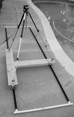
A dolly is a small wheeled vehicle, piloted by a dolly grip, which is used to move a camera around in a scene. A dolly shot is a move in and out of a scene, i.e., the movement is parallel to the camera lens axis. A tracking shot is a movement perpendicular to the camera lens axis. The key to these shots is to have realistic motion. The motion can be judged by looking at how fast humans move and then how many frames it would take to realize this motion. Examples of motion at different speeds are given in the table below.
 Hand held shots:
The hand-held movie camera first saw widespread use during World War II, when news reporters took their windup Arriflexes and Eyemos into the heat of battle, producing some of the most arresting footage of the twentieth century. Hand held cameras denote a certain kind of gritty realism, and they can make the audience feel as though they are part of a scene, rather than viewing it from a detached, frozen position.
Uses of Handheld Shots: Camera Moves: All About Camera Angles and Moving Shots eHow.comTuesday, 26 October 2010
TITLE OF HORROR TRAILER:
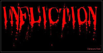
The title is perfect for the synopsis of the film too!
Here are different types of font for the title... decisions, decisions!

Monday, 25 October 2010
SOUND:
Non-Diegetic Sound: Raw footage is usually enhanced through the addition of non-diegetic sound, usually in the form of music or voice over.
Soundtracks: Previously-recorded music chosen because of its fit to the rhythm, content and mood of a sequence. If a song, the lyrics may add meaning to the film.
Voice over: The most efficient way to record a voice over is to find the quietest room possible and speak directly into the camera microphone. You can either record your own voice or find someone who suits the position better to do it. Remembering the gender, age and status of the person doing it will have different effects on the trailer/film its recorded for, as all of them will have implications for the meaning of the text used.
Sound Effects: Sometimes you just have to fake the sounds within the frame. Sound effects are often used to heighten realism by adding in sound at a crucial moment. Often you can download free sound effects to fit within the trailer.
Saturday, 23 October 2010
DIALOGUE:
Friday, 22 October 2010
MUSIC:
I have decided to use Muse-Hysteria' within the horror trailer as it is very fast paced as relates well to the trailer. It is the type of music you expect to be played in the background of a horror trailer.
I have currently e-mail Rich Costey who is the record producer of Muse, asking for permission to feature their music on my trailer. Just in case of copyright terms and conditions.
Hysteria by Muse has currently featured inthe film "Millions"by the famous Danny Boyle. It had two Muse songs in it. I think the song will relate better to my trailer because of the horror genre, whereas Millions is a comedy/family/drama genre.
Hysteria is also featured on the Guerlain perfume advertisement with Hilary Swank. But, I still think it sounds better and attracts the audience alot more when combined with a suspenseful/tense trailer.
Thursday, 21 October 2010
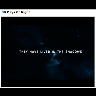
TEXT CARDS:
In our trailer we are going to use text cards to add suspense to the fast-paced horror genre.
Wednesday, 20 October 2010
Tuesday, 19 October 2010
Saturday, 16 October 2010
MY TRAILER PLOT:
Thursday, 14 October 2010
HORROR FILMS OUT NOW:
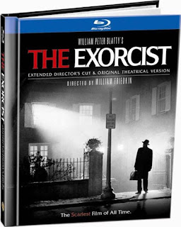 The synopsis of The Exorcist:
A movie actress taking up temporary residence in Washington D.C. has her troubles. The script for the movie she's filming seems inadequate. Her ex, who is also the father of her adolescent daughter, Regan, neglects to call the girl on her birthday. And the attic has rats. Meanwhile, Father Karras, a priest and a psychiatrist, is losing his faith; and he's dealing with a sick mother who needs medical care he hasn't the money to provide. Another priest, the old and ailing Father Merrin, has just returned from Iraq with forebodings of evil. These three persons meet when the sweet and cheerful Regan turns foul-mouthed and violent. But her sickness is beyond the reach of a medical doctor or a psychiatrist. What Regan needs is an exorcist.
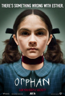 The synopsis of Orphan:
Kate and John Coleman are rebuilding their troubled marriage. Kate had a drinking problem, but is in therapy and is doing well. She has been sober for one year. The couple decides to adopt a child. When they meet the nine-year-old Estonian girl, Esther, at the St. Marina Orphanage, they immediately fall in love with the well-educated orphan. Their young son, Daniel, is hostile to his new sister; but their deaf-mute daughter, little Max, is enchanted with her - at first. Eventually, Kate begins to feel that Esther is manipulative and possibly even psychologically disturbed. John refuses to listen to his wife's misgivings, and the wounds in their marriage reopen. Kate calls Sister Abigail at the orphanage, and the nun informs her that Esther has a troubled and mysterious history. Kate delves further into Esther's past and discovers she is not at all who she pretends to be.
Tuesday, 12 October 2010
TRAILERS:
Sunday, 10 October 2010
TWO TYPES OF TRAILER:
THEATRICAL TRAILER: Put together towards the end of shooting/after the film has finished shooting, but while they are in post-production. Between 1:30-2:30 in length.
Monday, 4 October 2010
ROLES AND RESPONSIBILITES:
Myself: the costumes within the trailer, and acting with the trailer and filming.
Thomas: Props, locations and acting.
Jennifer: will be directing the trailer and keeping up with the continuity.
Chloe: will be filming the trailer and will be in charge of the lighting.
Instead of having one of us doing the editing by ourselves, we decided to work as a team on finalising the editing stages. This was decided because the editing within the trailer is such a massive part, and it would be unrealistic for one person to carry out this role.A2 PROPOSAL:
Monday, 15 March 2010
FINISHED REAL MEDIA PRODUCT:

FINAL COVER:
- A4 Portrait.
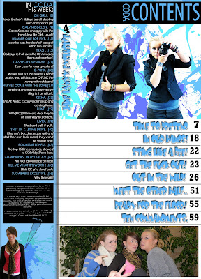
FINAL CONTENTS:
- A4 Portrait.
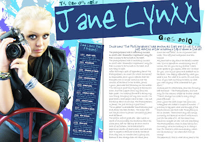
FINAL ARTICLE:
- A3 Lanscape.
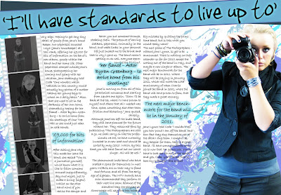 I added the 'splats' to the contents and article to match in with the magazine cover, not only does it give the magazine it's own uniqueness but it gives the magazine a set theme. Yet it takes away the boldness of the plain background and gives it a better look.
I also changed quite abit on the contens page too, just so it looked more professional.
EVALUATION:
n what way does your media product use, develop or challenge forms and conventions of real media products?
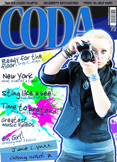
In the preparation of my media product - which was to create a music magazine front cover, contents page and an article, all based on the Indie music genre, I had to guarantee my final product realistic so it would be able to sit on the shelves alongside other major monthly magazines. Consequently I carried out some research of other products and into my potential target audience, 15-25 year olds. My main target audience is female, but I would like to appeal to males too.
 I aimed the cover at both sexes. I did this by having a conventionally ‘sexy’ posed female model as the cover girl, yet I kept the colour scheme to cool blue tones, which are stereotypically masculine - the colour scheme was retained throughout the magazine which gives the unique magazine its own house style, just like ‘Blender’ (2008) often keeps its layouts practically the same, with a very large image of the model in the centre of the page and little hooks around it. Having the same colour scheme throughout the magazine gives it its own house style
  and makes it more recognisable, so that when the reader goes to buy a magazine, they just need to look for the blue colour scheme of the magazine I’ve produced and their brain automatically tells them it’s the norm.
Furthermore, having all the text justified and in a specific layout helps the audience just look at exact areas on the page, such as ‘big quotes’, bold writing, the font type, the font size and the story hooks used, often used in ‘Q’ magazines. I broke this convention by placing them all down the left hand side of the cover. I used an asymmetrical cover layout. These all help the naked eye focus on that area where the magazine has emphasised to draw in attention. On the cover the story hooks aren’t straight, but are justified to the left hand side of the cover. Using bold writing for the story hooks emphasises them so that the reader spots the catchy hooks without delay. I justified the layout of the cover so that the image of the model was in front of the title. I did this because people are meant to know the name of the magazine whether or not it is partially covered or not. Magazines such as Blender (2007), NME (2009) and Vibe (2007) use this convention.
The barcode, the price and the date of the issue are all based on front cover conventions too. Using a ‘regular’ price of £1.95 was chosen by the niche market audience. They chose this cost through the questionnaire I handed out, and they thought that £1.95 was the perfect, yet, regular price to pay for a magazine of this type.
(https://blogger.googleusercontent.com/img/b/R29vZ2xl/AVvXsEjJ6c6VQm0FSAkw0XLS6DOB0k29__hfpFfXwUZq_OBq7ruksSH3MaKVTom8sohebP2HpwY-xWE9GYzuc0PYdH3i_JHn69iG4I8GTpOiMpod4UxEtI41wGOH_kNY2HJmKsnc9SRNBhlE4cs/s320/NME-contents+page.jpg).
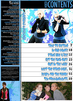.jpg)
I kept to the colour scheme and typical conventions of a magazine’s contents page, yet made it my own. I did this was by using a layout that was simple yet unique; I also used new images of Josie (the cover girl model) in the same clothes, just so she wasn’t in the same pose on the contents too. I used columns on the contents which almost every magazine uses, whether it is one, two or three. I have the magazine website on the contents page too, which is common in the age of web 2.0 for magazines to have a website so readers can interact with the publication, which gives the magazines more reputation, if people ever wanted to go on the website. I added an editor’s message to the contents page, to let the reader know a little more about the magazine – this is something I’ve seen in other magazines like ‘Uncut’.
 The justification of the text is aligned to the right hand side. In the main article section of the contents page, a funkier writing font is used - ‘Baby Kruffy’ - this is to grab the readers attention as it is cooler than the normal ‘Century Gothic’ used on the left hand side of the page, which is used to list the smaller stories inside the magazine.
I also found in magazines such as Blender (Aug 2007) the cover girl featured in the main article of the magazine., so, I used my cover girl as the main feature article too, to stick with the common convention in a magazine. The article I created could be seen as quite inspirational as it is based on an up and coming celebrity who has had to chose her security and her welfare over her new found career as a lead singer in a newly famous indie band, which is becoming the new genre in the charts today. This acknowledges a heroine-like character and shows ‘Jane Lynxx’ in a positive light. Although my article is sympathetic and world encourage my readers to aspire to be like her, it shows some of the pitfalls of fame.
Bauer media publishes worldwide, with an approximate empire 282 magazines in about 15 countries. They work closely with their customers to develop new solutions which make a difference within their business, just like I have by using a questionnaire to find out the customers needs and then acted upon it. (http://www.bauer.co.uk/aboutbauer) I would be widening the market for them, which will offer them an opportunity to expand their audience into a new market of 15 – 25 year olds. With Bauer I would be widening their portfolio. Also publishers from other retail magazines such as Blender’s:
Dennis Publishing (http://www.dennis.co.uk/dennis_site/about/dennisgroup.php) I’m sure would publish my magazine. As I am sure my media product would get far in the
Name: Sophie Handy
Age: 17
Occupation: Full-time student.
Why would she read this product: I sense my music magazine would hit an audience of the upper teenage working class population, interested in the latest music. I am aiming largely at a female target audience – but I hope by my colour scheme and the fact that the males are more likely to be interested in this sort of music and backgrounds – that it will appeal to males too. Someone with an office job would buy this magazine against others on the shelves, maybe with an interest in chart music and attends the latest gigs around the country. Someone with a peaceful night time, time to chill or relax and read a magazine – like the one I have produced, and a lot of spare time on his hands, other than the time spent at the latest music band gigs and at his job. Maybe even a fit and active man, around the age of 20-25.
When planning how to create a typical, modern music magazine, I had to find out what
 the target audience wanted.
Another theory I exploit is Uses and Gratifications. This suggests that the audiences actively use media products and magazines to meet some of the needs identified. Magazines may be used by the audience to compensate for the lack of self-esteem or social success, as an example of the girls’ teenage lifestyle magazines, which address the audience as a ‘best friend’ rather than an authority figure.
Magazines always exploit the theory of uses and gratifications because the target audiences they’re aiming to gain, will identify (though most of the time its wishful thinking) with the lifestyle it promotes. Marjorie Fergusons theory (1980) identified four types of facial expression in the covers of magazines found on the shops shelves today. I think his theorem best covers my magazines stylistic features due to the fact my model isn’t sexually posed, but looks quite invitational. http://lauraarobinsonn.blogspot.com/2009/11/majorie-fergusons-theory.html
.jpg)
McQuail, Blumler and Brown (1972) defined four major areas of need which the media in general seek to gratify, including:
- Personal Identity – people can relate to my cover story, and will buy it because they feel some sense of belonging because the magazine involves them by featuring a genre of music they feel important to them.
- Surveillance – people can use my magazine to retrieve information about topics they’re interested in. Like from a contents page.
Also Davis et al. and Julianne Dickey convey how they take the traditional stance that images of women are dominated by the male gaze – the masculine view of female beauty – and the female form is objectified for the male pleasure, giving a very narrow definition of femininity. Such theorists are also critical of the media industry being run by the masculine view. For example: most photographers are male – and I went along with this convention of using an attractive model, but tried to empower her by posing her photographing those ‘gazing’ at her.
I enjoyed using the digital camera and the tripod as I experimented with diverse camera shots, such as – medium shot, medium close up, and long shot – and angles, such as low angle and high angle, to show social class and superiority.
To cut out the image of the model on my front cover from the background she was on, I
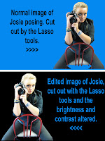 used the normal lasso tool which helps by clicking specific points around an image. Photoshop will draw straight lines from point to point as you continue to click on the canvas. I then used ‘Delete’ to undo a point and try again. This tool is not ideal for cutting out really difficult images, but is good for accuracy as you click where you want cut out.
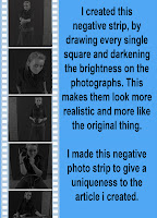 I made a negative strip from scratch. I drew out every single square around the edge of the negative strip by using the square shape tool. I then drew the background as a bigger box than the images then placed all the little white squares around the edge, to make it look like a negative strip from a photo shoot. Furthermore, I added in the images and made them all the same size so it didn't look odd. However, I changed the brightness of the photographs and the saturation so the images where dark and black and white. I did this to make it look like they were negatives from a camera. Then, I fixed all the layers together so the piece was a whole, and then could move everything around as one layer, rather than 70 little ones.
On the cover, I used a splatter brush to create the ‘ink print’ marks on the background, I downloaded this brush off of the internet; I used the technique/process of whitening the hair of the model and her skin by using the dodge tool.
The blog I created allowed me to take advantage of web 2.0 to become a producer of a media artefact with an internet audience of millions who can comment and post about my work. I combined text and images to explain the ideas and processes behind my magazine which can be found on my blog. Using the blog meant that I can layout our plans and show my annotations and it can be viewed by the public, who can provide feedback.
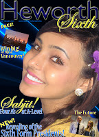
Looking back at my amateur preliminary task I feel that I’ve progressed a lot. My imagination, publishing and photography skills have improved and I have a much deeper
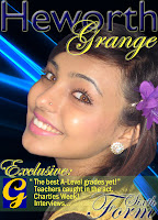 understanding of how to produce a professional product on Adobe Photoshop for a selected genre, age range and target audience. I also feel confident in representing my views about design. I also can see the difference in professionalism between the two products and I can now see how I could have made the preliminary product better by gaining some more knowledge or practise on Photoshop. My research skills have advanced, as I analysed magazines and understood the conventions they used to attract their target audience, like specific colours, fonts and models to communicate a particular message to them. I have understood the importance of audience research by creating a questionnaire and this helped me find their needs, so, I could accurately target my magazine to meet the audience’s needs and produce one that could compete on the shelves ‘NME’. From my study of other music magazines and their conventions, I learned that a magazine should not be too busy, as when there is too much to look at it takes the attention away from the main purpose of the magazine, which is for a reader to actually look inside, yet it should be attractive and eye-catching enough to stand out from the crowd of the mass of other music magazines that are on the shelves today.
  Furthermore, my knowledge of writing in a journalistic style has improved and I’ve very much enjoyed the challenge of completing my production of a ‘real media artefact’ for a deadline. I’ve moved on from producing pages for a magazine with an extremely localised niche audience to planning, researching and producing a magazine aimed at a wider – national – niche audience that can compete in the market with existing products such as ‘NME’, ‘Blender’ and ‘Vibe’.


